Redesigning Candidate Management into a Fast, Unified Workflow
Workable is a global B2B SaaS platform that powers hiring for over 27,000 companies. At its core lies the candidate profile and pipeline view — the area where recruiters manage candidates across hiring stages, review resumes, communicate, and make critical hiring decisions.
Over time, the pipeline and profile experience had become cluttered, inflexible, and slow, especially for high-volume hiring teams. Users struggled to:
Filter candidates beyond basic fields
Navigate bloated layouts
Act quickly on candidate information without switching screens
Client
Workable
Areas
HR Tech
SaaS
Workflow Optimization
Services Provided
Product Design, UX Research, Stakeholder Management, UX Strategy, Design Systems
Tools used
Figma, Hotjar, Jira, Sketch, Miro

Summary
The candidate view is the beating heart of the ATS — used daily by recruiters to assess candidates, move them through stages, and collaborate with teams. After years of incremental changes, it could no longer meet user expectations or performance standards.
Research methods conducted
To inform our design decisions, we leveraged a mix of qualitative and quantitative research methods. We conducted over 30 user interviews across company sizes and industries to identify consistent patterns and pain points. FullStory analytics and heatmaps provided behavioral insights into friction points and usage drop-offs. Finally, competitive benchmarking helped us understand how leading ATS platforms approached similar workflows and where Workable could differentiate.
Key findings & Pain points
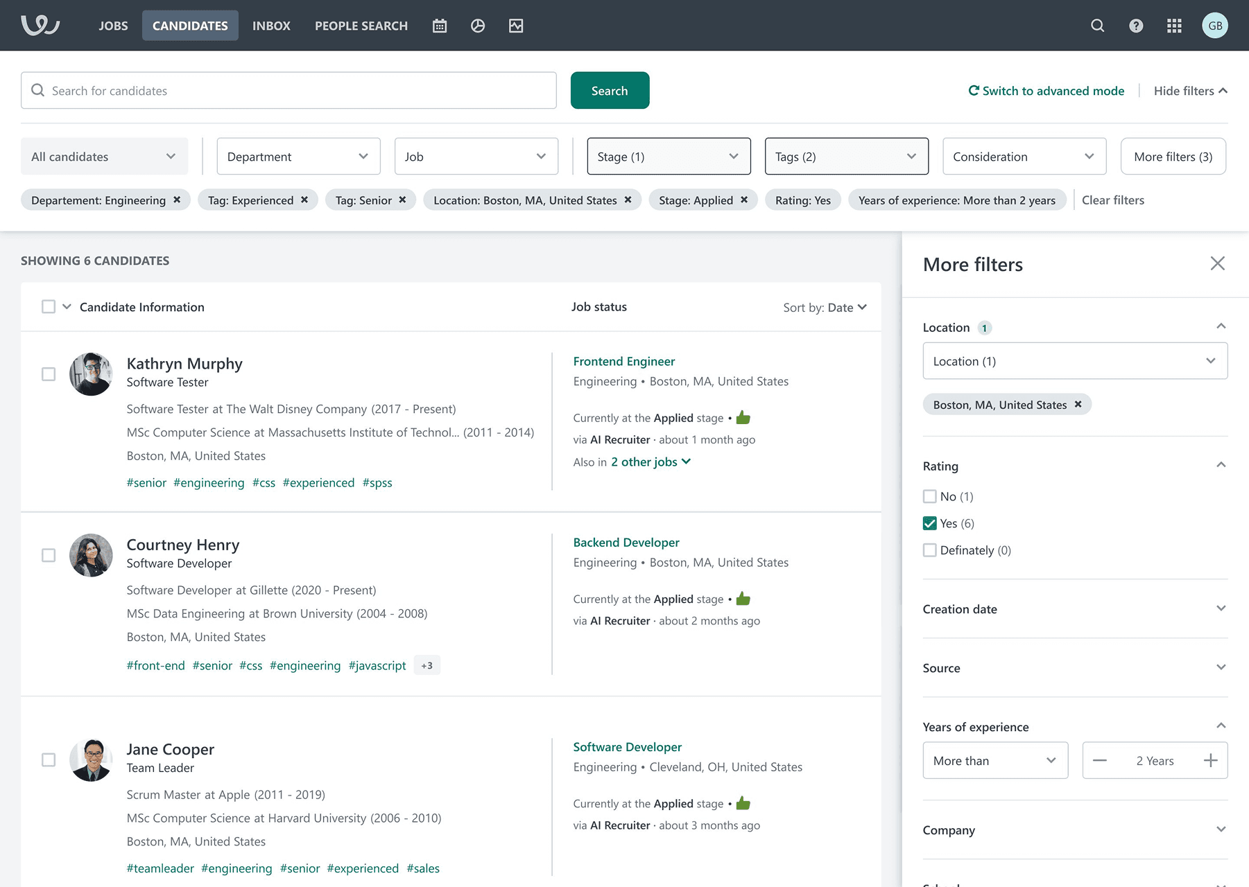
Our research uncovered recurring usability breakdowns across teams and workflows. Recruiters struggled with fragmented task flows, excessive context switching, and an overwhelming interface. These inefficiencies slowed down hiring operations and led to frustration. We also identified two critical technical bottlenecks: resume uploads were painfully slow, and the search functionality lacked the flexibility recruiters needed to operate at scale.
💡 Key findings
🚨 Critical Pain Points Identified
Insights & Project alignement
We aligned early on with business leadership and engineering around the principle of: “Faster decisions, fewer clicks, less switching.”
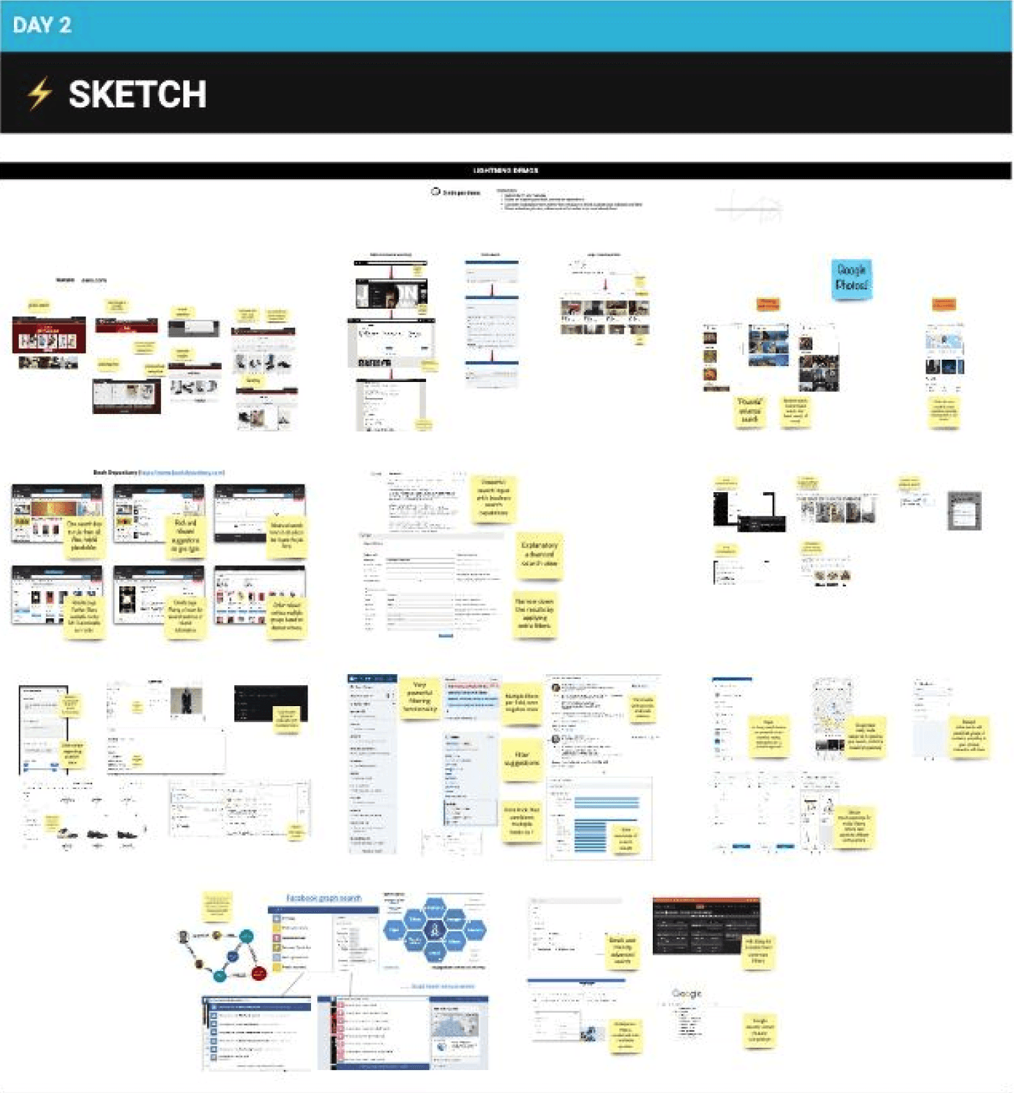
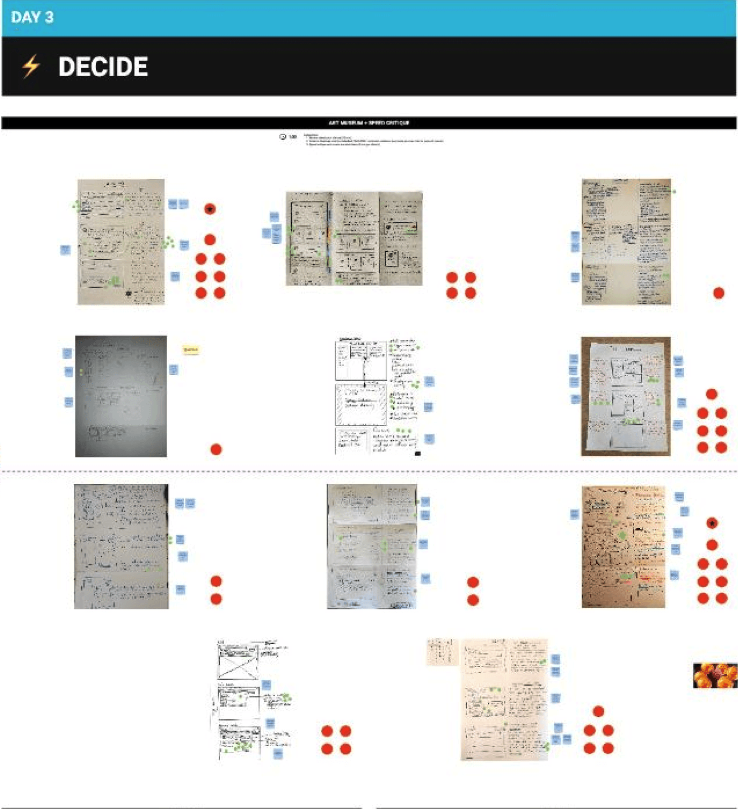
Design Sprint
At the start of the project, we gathered all the feedback we have received from various touch points and we organised a 5-day design sprint with all the stakeholders of the team included (Devs, PMs, designers) to ideate and test our design assumptions and ideas.
On the 5th day, we tested our ideas with 5 users, providing us with crucial early feedback to move forward.
User personas
Recruiters - Working across multiple open roles
Hiring Managers - Needing quick overviews and decision-making support
Agencies/Enterprise Clients - With high-volume data and full custom needs.

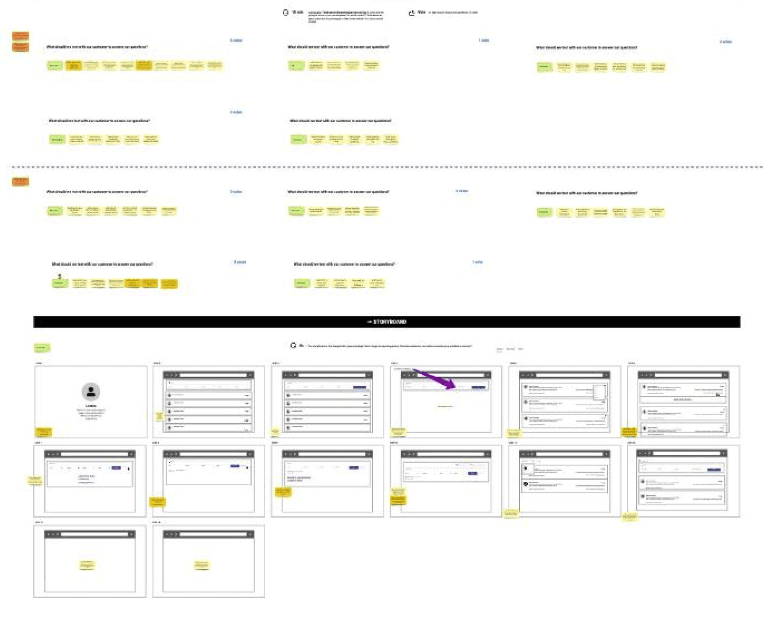
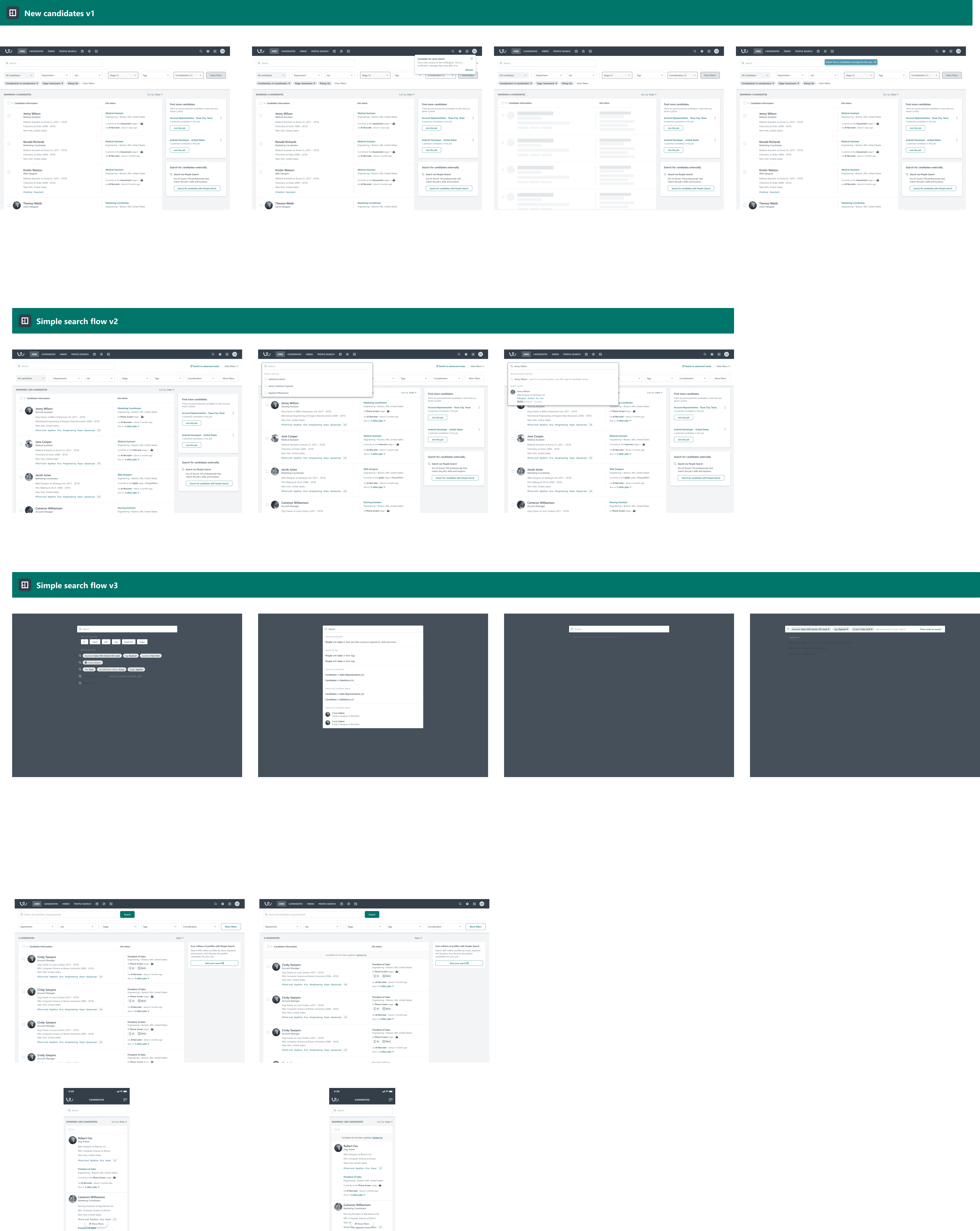
Wireframing & Information Architecture
After the Design Sprint, I rapidly produced mid- and high-fidelity wireframes to validate assumptions and test UX flows. The design system we have developed, helped for rapid changes and A/B testing.
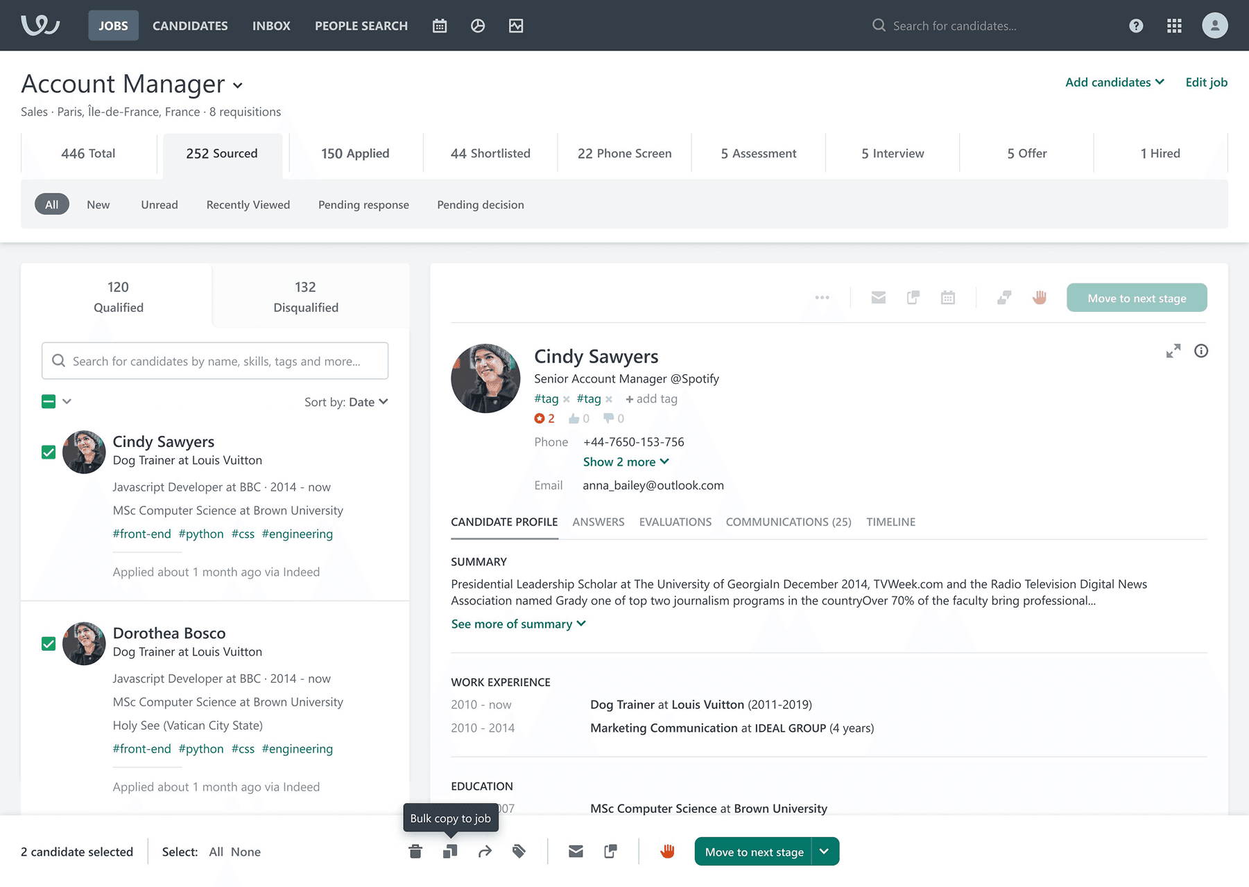
1. New Candidate Overview
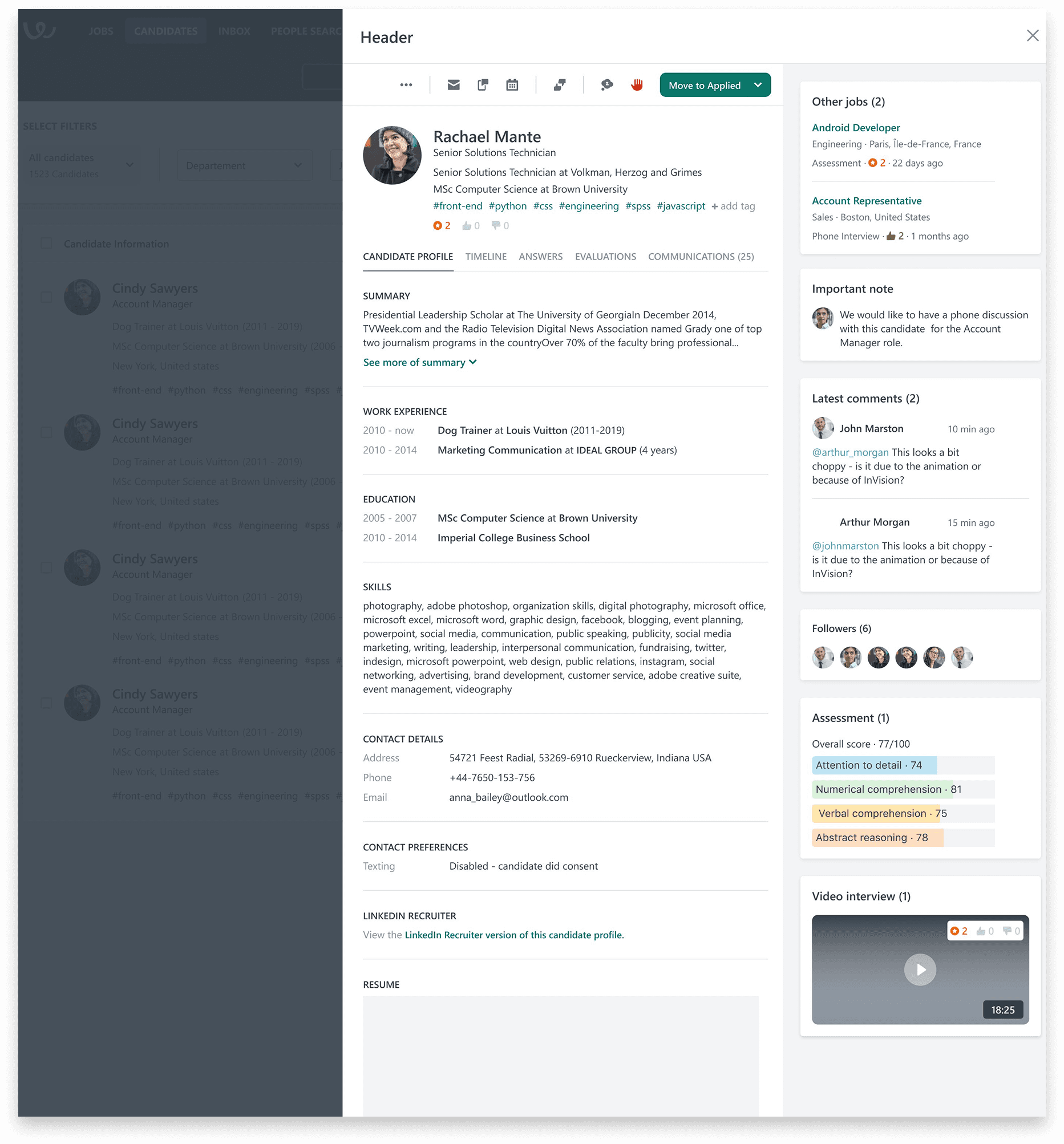
We restructured the candidate profile to surface the most actionable data first—status, activity, and resume—while keeping auxiliary content collapsible. This enabled recruiters to work faster without losing context.
2. Simplified Navigation & Panel Layouts
A persistent right-hand panel was introduced to centralize notes, evaluations, and communication. This allowed users to act in-line without switching screens, directly addressing the fragmentation pain point surfaced in research.
3. Streamlined Resume Upload Flow
The new flow reduced friction during high-volume imports, cutting down steps and enabling better feedback on upload state. We focused on speed and clarity—especially for enterprise recruiters managing bulk resumes.
Key UX Decisions & Solutions
Each decision addressed a core friction point, translating insights into focused, high-impact UX improvements.
1
Unified Overview Panel
We surfaced essential candidate info (status, notes, activity timeline) in a persistent right-side panel so users could act without losing context.
2
Action Without Leaving
Composing emails, leaving evaluations, and editing data can now happen in-line, without screen switching.
3
Advanced Search Engine
Built support for Boolean and dynamic filters to allow power users to search across all candidate fields.
Final mockups
Outcomes & Metrics
The redesigned experience delivered measurable impact across core workflows, significantly improving speed, user satisfaction, and adoption among high-volume hiring teams.
1
x3 faster
Resume uploads
2
30–40% faster workflows
Faster workflows for core actions (f.e. emailing, evaluating)
3
High satisfaction among beta users
600+ surveys, overwhelmingly positive

