Boosting Hertz's online sales by redesigning Booking Engines
Transformed an outdated car rental experience into four streamlined digital platforms, optimizing conversion, reducing booking confusion, and enabling Hertz to scale its online presence across business units.
Client
Hertz Autohellas
Areas
Travel tech
E-commerce UX
Conversion Design
Services Provided
Web Design, Web Development
Tools used
Sketch, Jira, Hotjar

Summary
Hertz Autohellas, the leading car rental provider in Greece, set out to transform its fragmented and outdated online experience. With most transactions still occurring offline and a lack of clarity in the booking process, user frustration and booking abandonment were high. The redesign introduced four responsive, dedicated booking platforms-each tailored to a distinct business vertical. The result was a streamlined, conversion-optimized system that significantly improved performance across all channels.
Research methods conducted
To redesign Hertz’s booking experience with precision, we began by analyzing the business goals of each service vertical (rental, leasing, van hire, chauffeur). We conducted internal stakeholder interviews to understand operational gaps and held targeted user testing sessions to surface friction in the existing flow. In parallel, we reviewed analytics and conducted competitor audits of top car rental websites to benchmark expectations and spot UX deficiencies. These insights guided the foundation for segment-specific IA and content strategy.
Key findings & Pain points
Key usability insights and systemic issues uncovered through research, guiding strategic design improvements.
💡 Key findings
🚨 Critical Pain Points Identified
Service Design & IA Strategy
We analyzed the unique needs of each business vertical including car rental, car leasing, van rental, and chauffeur services. Each offering had distinct users, expectations, and operational constraints. By defining separate user flows and IA models, we ensured that content and navigation were fully aligned with user intent. This led to the creation of dedicated microsites that delivered focused, conversion-oriented experiences.
User Types & Booking Contexts
We identified unique user behaviors tied to each business stream — from daily rental users to long-term leasing clients. Rental users prioritized quick comparisons and seamless mobile experiences, while leasing customers demanded detailed information, flexible configurations, and service reliability. These patterns shaped key journey priorities and segmentation logic.
Content Personalization Strategy
Each microsite was tailored with dedicated content hierarchies and UI modules, reflecting the business model and decision-making path of its target user. The rental flow emphasized offers, vehicle availability, and booking speed, while the leasing flow prioritized configurability, credibility, and service terms. This modular approach ensured relevance without compromising brand cohesion.


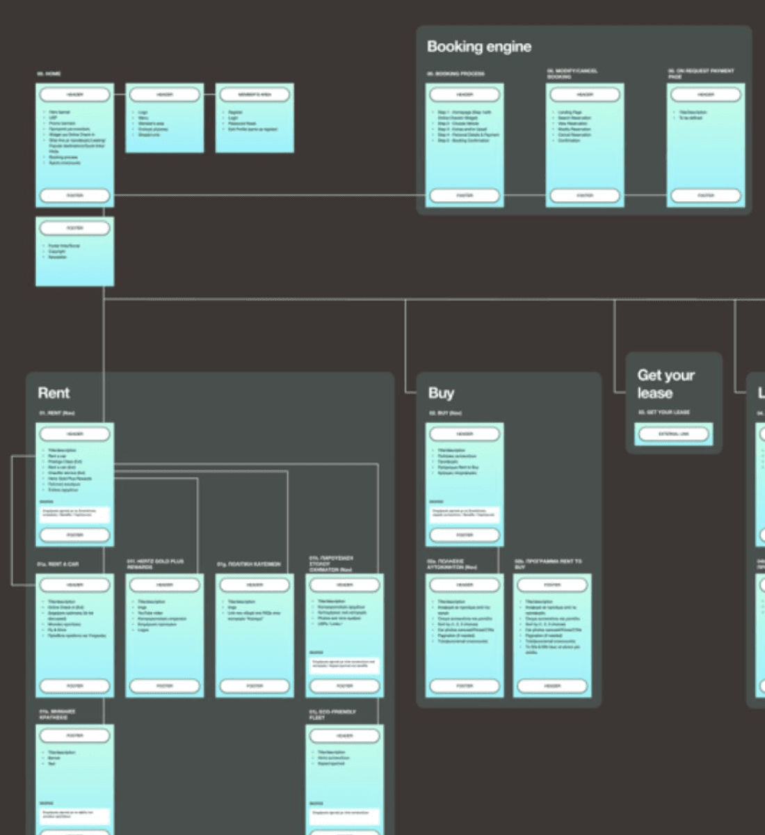
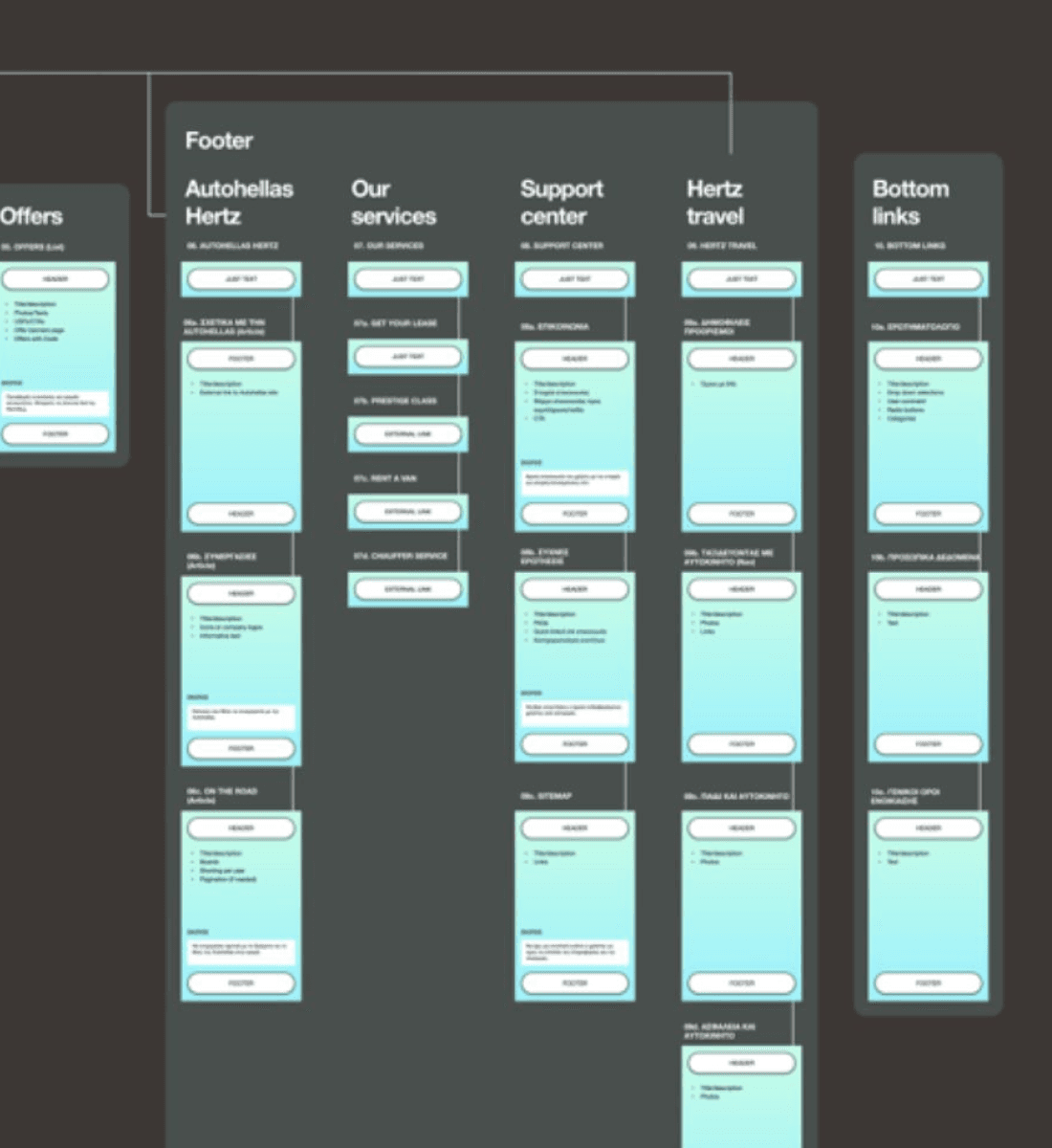
Wireframing & Layout Testing
Following the completion of the IA and service design, I focused on rapidly producing mid-fidelity wireframes to validate assumptions and map booking flows across different user types. This phase prioritized fast iteration cycles and early feedback, helping reduce misalignment before visual design began.
1. Modular Wireframe System
A flexible wireframe style guide was created to standardize components across flows and speed up the iteration process. This allowed for consistency, easier collaboration with developers, and faster adjustments based on user input.
2. Rapid A/B Testing & Validation
Multiple booking journeys and layout variants were tested with a small target audience to assess navigation clarity, content visibility, and conversion potential. Insights gained helped refine the hierarchy and UI logic to better align with user expectations.

Key UX Decisions & Solutions
The redesign phase translated research findings and wireframe testing into tangible UX improvements tailored to each service vertical. The focus was on reducing user friction, making key actions more intuitive, and optimizing layouts for clarity and conversion across mobile and desktop platforms.
1
Dedicated Portals per Service
Each vertical received a standalone experience tailored to its service model and customer expectations.
2
Mobile-First Structure
I restructured page layouts and navigation to prioritize mobile users, ensuring performance, readability, and touch-friendly interactions.
3
Conversion-Driven Layouts
Offers, CTA buttons, and trust-building elements (reviews, guarantees, location clarity) were placed with precision to support immediate decision-making.
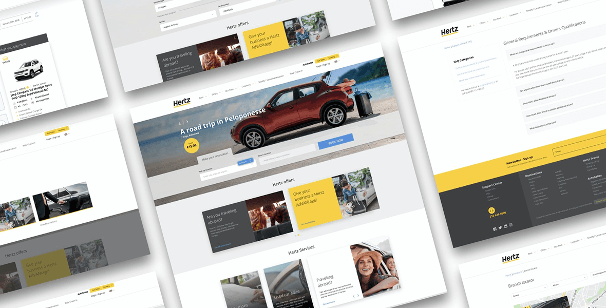
Final mockups
Outcomes & Metrics
Description goes here
1
+347% Increase in Time Spent per Visit
Users engaged longer with the platform, indicating improved usability and a more immersive experience.
2
-38% Drop in Mobile Bounce Rates
Mobile experience optimization led to fewer drop-offs, making the platform more effective on smaller screens.
3
+56% increase in pages per mobile session
Improved layout, clearer car availability, and simplified booking steps increased booking reliability and reduced cancellations.

